GOV.UK
GOV.UK won the Design Museum’s Design of the Year award and a D&AD black and yellow pencil.
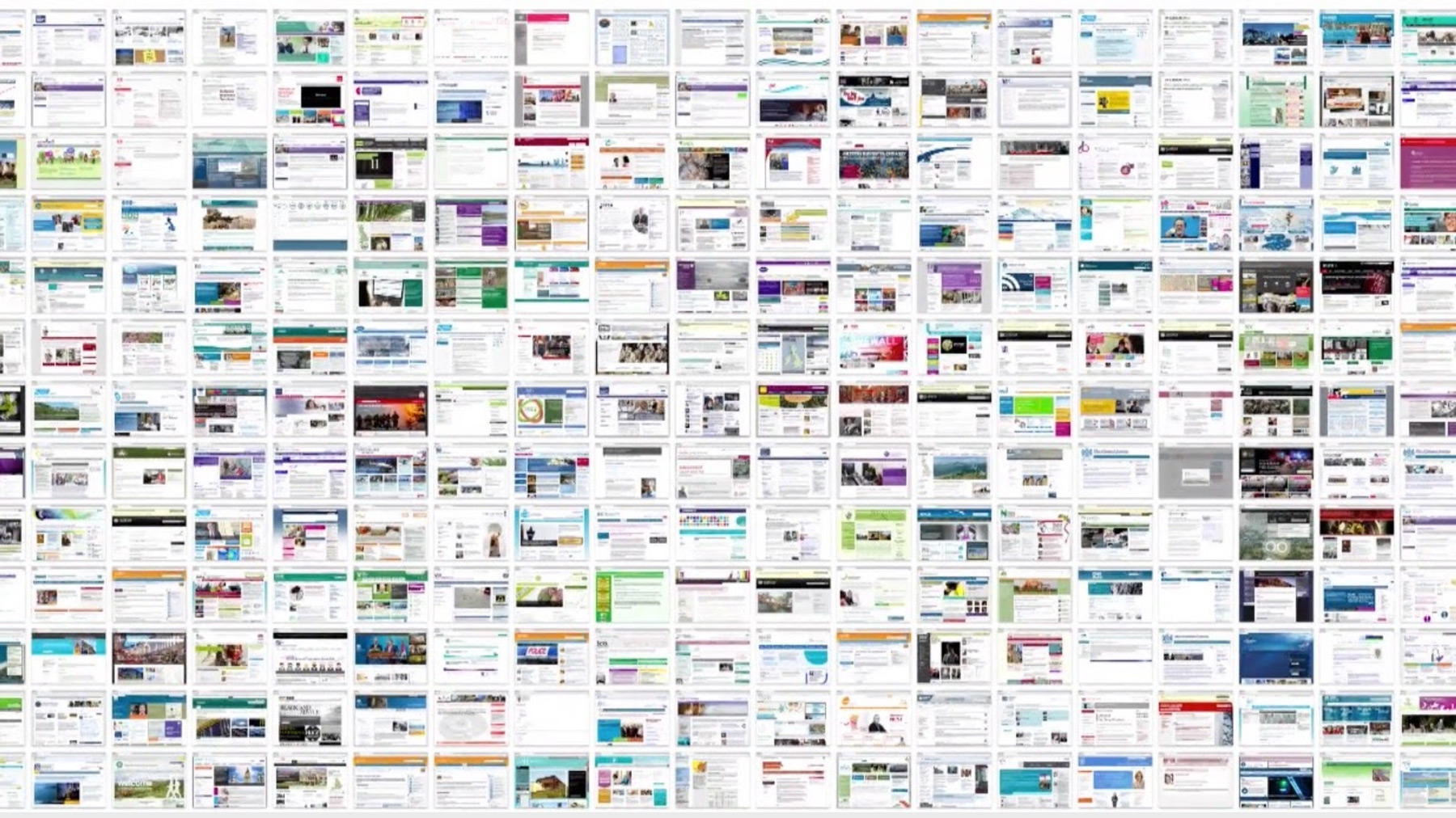
The old world of inconsistent government org websites that didn't meet user needs
Creating a trusted design language
I helped create the simple and trusted GOV.UK design language. Our aim was to build a robust design framework that could easily incorporate the varying content across thousands of government websites and enable the fast creation of new digital services. This needed to be done while maintaining the trust and confidence of the millions of users who interact with government daily.
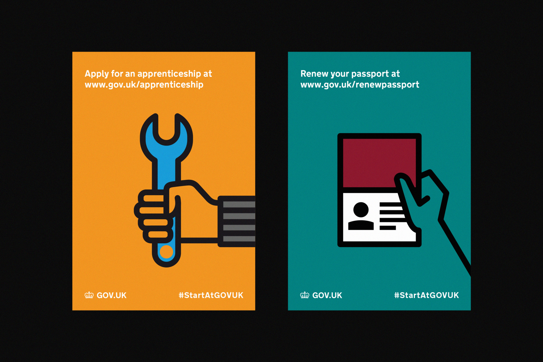
The GOV.UK design language needed to be recognisable and trusted from the start. Visual cues were borrowed from established and recognisable symbols and infrastructure to build familiarity. Items such as the crown and road sign infrastructure were used to great effect. The typeface 'New Transport' that we used is a modernised version of the typeface used on road signs across the UK.
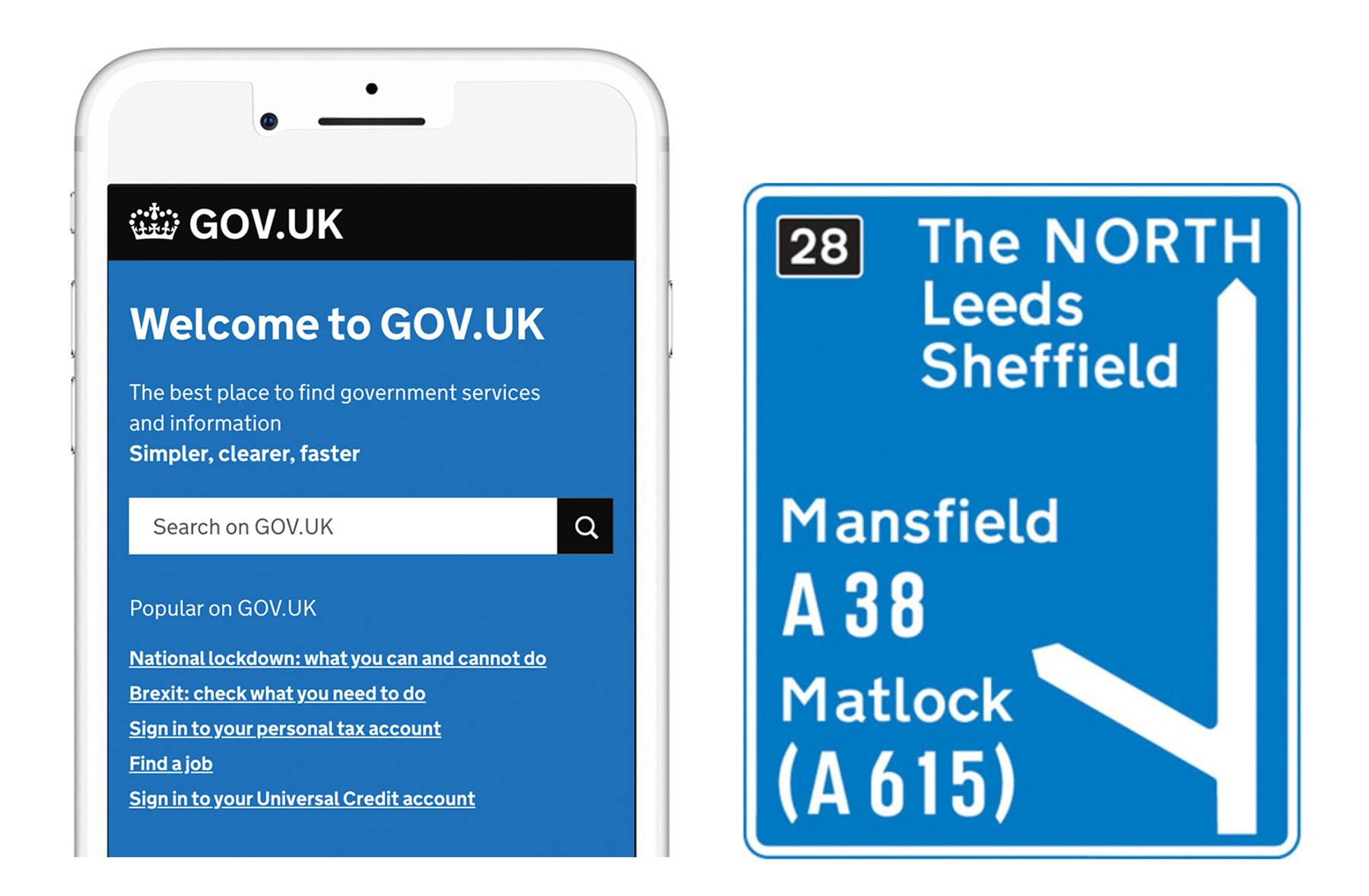
The GOV.UK design language needed to be recognisable and trusted from the start. Visual cues were borrowed from established and recognisable symbols and infrastructure.
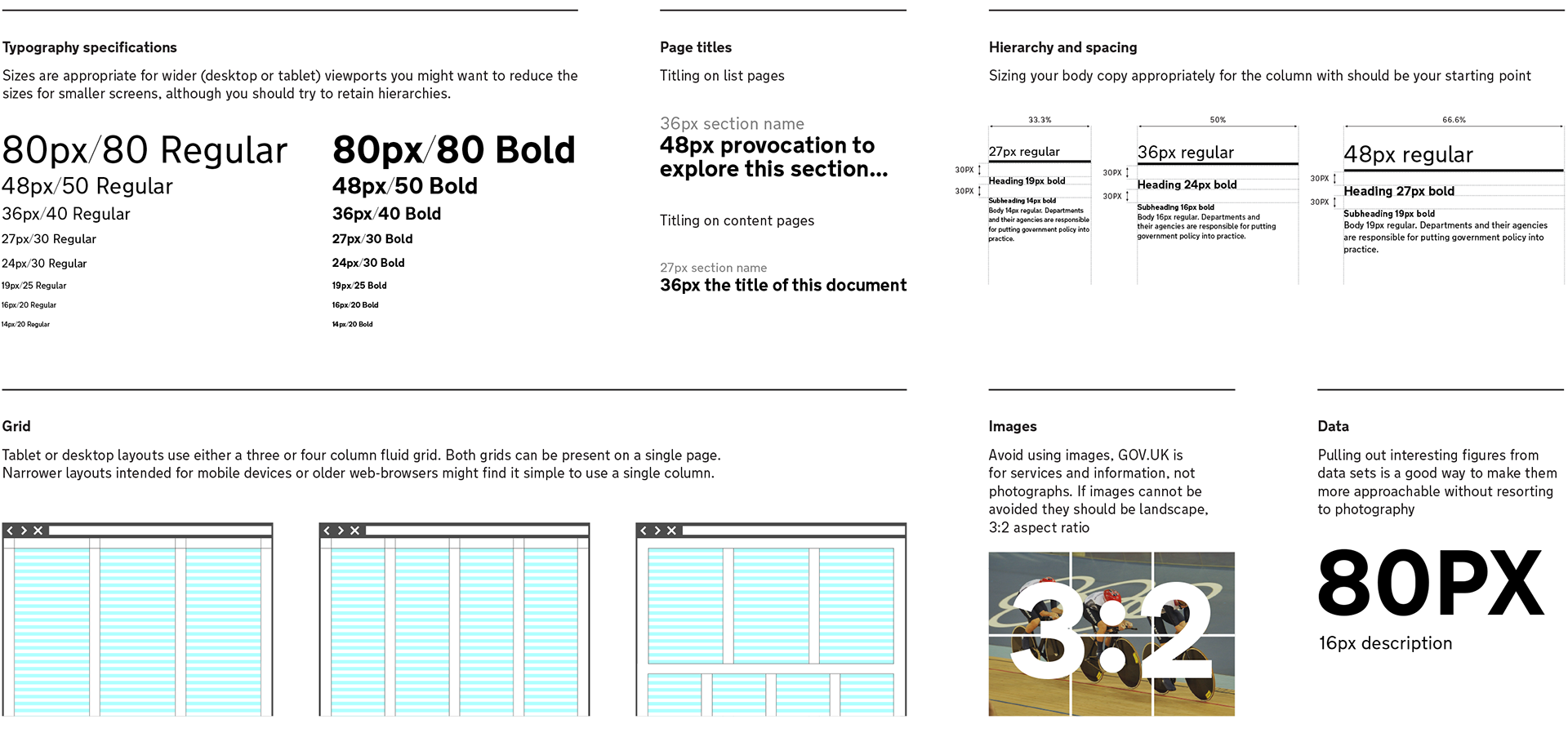
Using graphic design as an enabler for content and interaction design we developed simple and consistent information hierarchies, page formats and interaction patterns. We focused on how our users interacted with the information and iterated accordingly. The typographic and layout specifications we developed were carefully considered for maximum legibility, readability and effective hierarchy. Our goal was to ensure that content was legible and easy to read for everyone, and that information and interactions could be clearly understood.
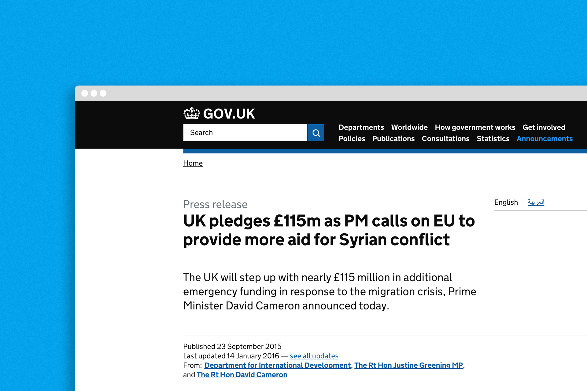
The legible and responsive GOV.UK design language
Understanding user context
We’re government so we have to design for everybody. Understanding the context of how people use the site is very important. People use it daily in parts of the country with slow internet speeds and on old browsers. We support those users by making it quick and easy for them to access the information they need.
GOV.UK is used by people of all backgrounds with a wide range of digital skills and access needs. That greatly influenced the inclusive design language and content style we developed.
An example of the usable and accessible UI elements we developed

An example of the range of information a user might need at any one time
User feedback on the Lasting Power of Attorney service – emphasising the impact of GOV.UK on people's lives
Helping people find what they need
Information that used to live on thousands of disparate government sites now lived on GOV.UK. This was a mammoth design task and also a once in a lifetime opportunity to offer people a much more useable experience when navigating government. We relied heavily on qual and quant insights to craft an IA, navigation structure and user journeys that made sense to people.

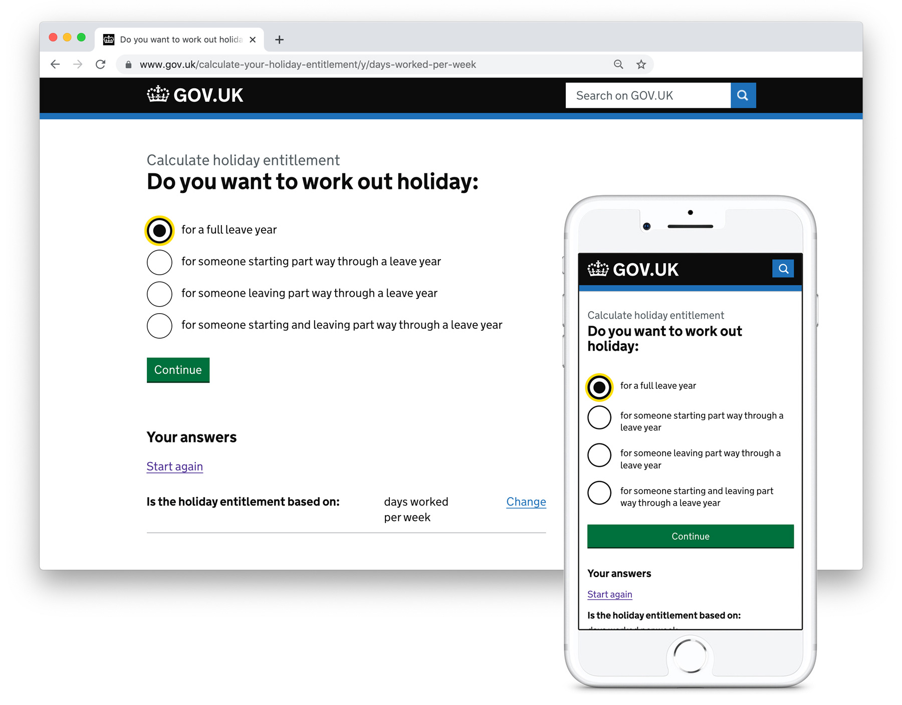
Navigational page showing how people access a topic. We spent a lot of time testing and refining IA and navigation structures that worked for users across a vast range of topics

Some of the complex services and information users and businesses interact with on GOV.UK

Navigational pages showing how individual citizens and businesses can navigate a range of business topics

I also created the foundation for key dashboards to be used by high ranking government officials to quickly understand the state of play regarding business, employment, benefits, visa applications and other key government policy areas
Letting the content do it’s thing
The temptation can be to add graphic flourishes where they aren’t needed. With GOV.UK every element on the page should have a clear purpose. Decorative items that don’t serve a purpose are removed. Unless there is a clear need, design shouldn’t get in the way of content.
With GOV.UK the aim is to help people find and understand important information as efficiently as possible. That’s why we minimise the other aspects of the design that might distract from the words.
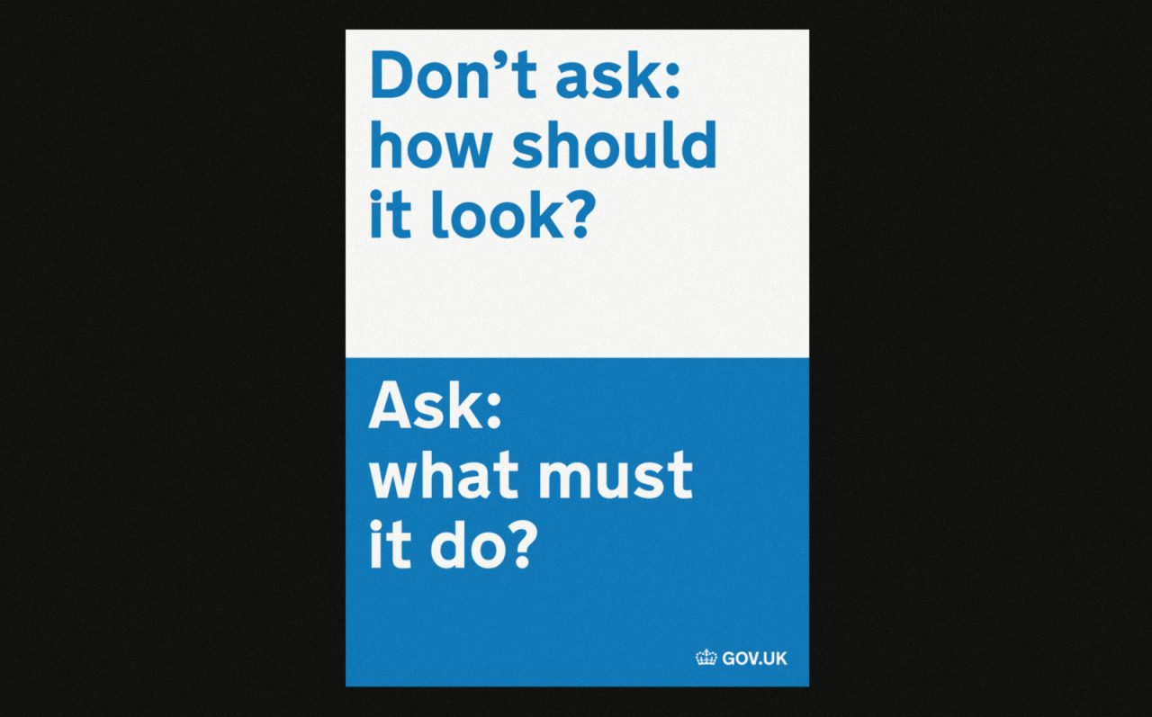
Poster outlining the approach, ‘Don’t ask: how should it look. Ask: what must it do?’
Bringing departments along on the journey
We transitioned 450,000+ pages of organisational content to GOV.UK and also gave each organisation a homepage on the site. This enables users who want to find specific information or guidance related to a certain government organisation the place to do so. We pushed for clarity and transparency by having a single page of scrollable content so users can easily find items such as contact details and information on senior departmental officials.
Imagery also plays a key role on these pages, which is different from most of GOV.UK. It is important that departments make the right editorial choices when choosing imagery for featured stories. To support them with this I helped develop a training programme for government communication officials to help them select and develop appropriate imagery.
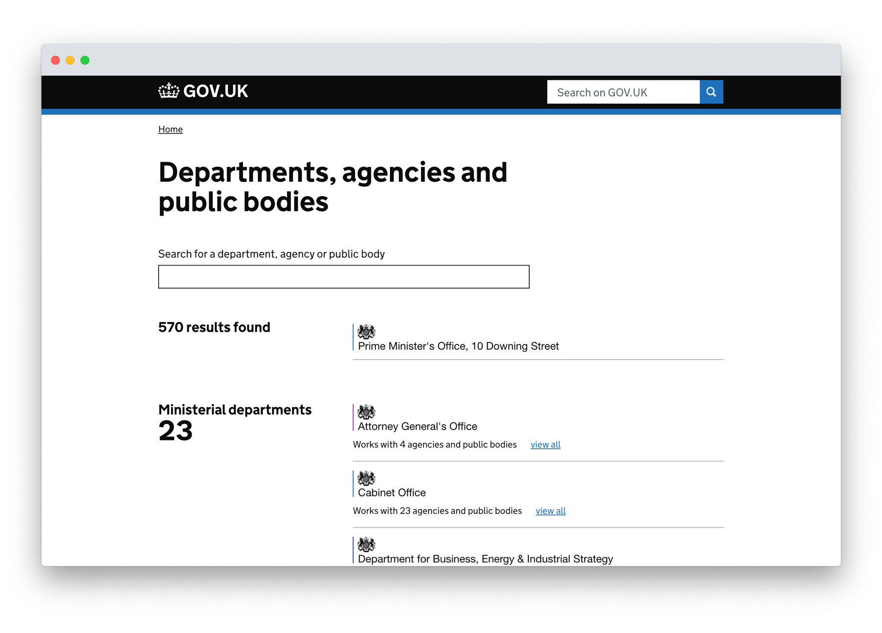
Organisation list on GOV.UK
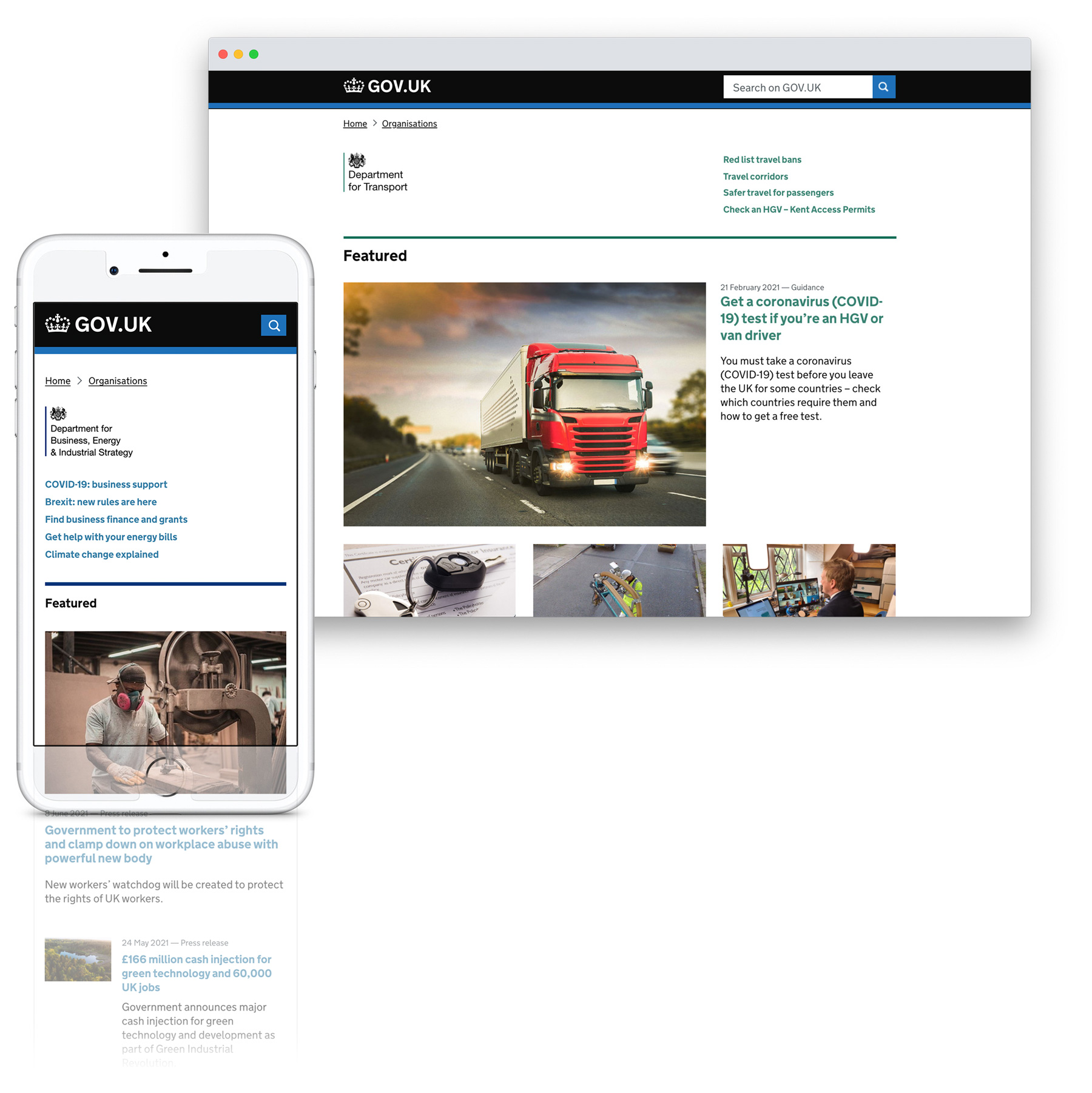
Responsive template for organisation homepages on GOV.UK


Some of the Foreign Office pages displaying important travel information to people
Building for the future
The GOV.UK homepage isn’t dynamic enough and because of its rather static nature it isn’t meeting user expectations when people come to GOV.UK for critical information needs during times of uncertainty or flux. We created ways in which we can better meet user needs by having trending content at the top of the homepage and also building out a more dynamic featured section to cater for a bigger selection of topical government content.
This work involved close collaboration with central government communication leads in order to drive an effective and coherent editorial policy.


Homepage designs showing urgent topical information and a more dynamic featured section
GOV.UK had over 5 billion page views in 2021 alone. It's now classed as critical national infrastructure. It was also named by FastCompany as one of the 14 most important design's of the decade (2010-2020), alongside things like the iPad and Tesla Model S.
A snippet of the GOV.UK corporate comms style I developed