Which? brand refresh
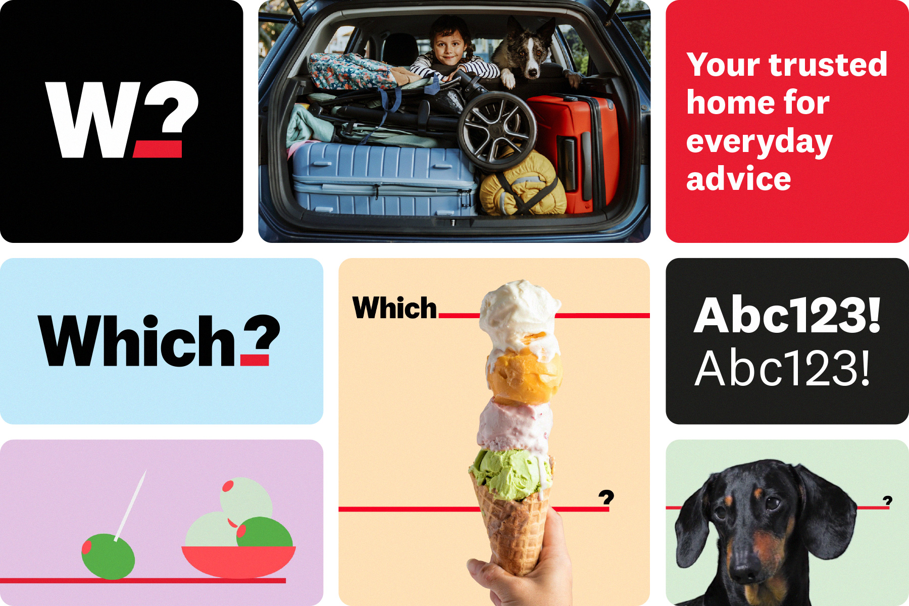
A selection of new brand assets
Business problem
A big area of work I’ve been leading on since I joined Which? has been our brand and proposition refresh. We’ve used this an opportunity to not only improve the user experience of our product offering – but also shift perceptions of what people can expect from Which?.
Which? is the UK’s consumer champion – but we have a relevancy problem with younger audiences. They know about us, but we are low on the consideration scale. By making Which? more appealing to wider audiences, beyond those wondering which washing machine to buy, we can help more people with their everyday needs.
By showing how we can regularly help people make good choices, we can begin to demonstrate our value to new users earlier in the acquisition funnel and retain more users when they join.
The old Which? logo on the left / The new logo on the right
The new logo with extendable line
Creating a more approachable brand and user experience
With the new visual language, we opened up a dynamic space using an iconic red line between ‘Which’ and its question mark. This prompts people to ‘fill in the gap’.
We created a warmer, more approachable and relatable design language – with a new colour palette, image and illustration style that reinforces clarity and impartiality.
The below video shows how we are beginning to inject playful movement into the brand. The aim is that this will manifest itself across all our digital channels, including sensible use across our app and websites to build a warmer brand experience.
We worked closely with ODA to develop this new brand proposition and design language for Which?.
The full wordmark alongside the shorthand mark used on app stores and social media

The full wordmark and how it works with the secondary colour palette
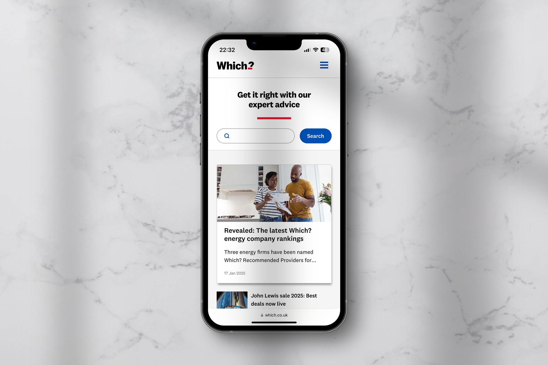
Mobile web view of the mobile homepage showing the proposition, 'Get it right with our expert advice'
Constraints and learnings
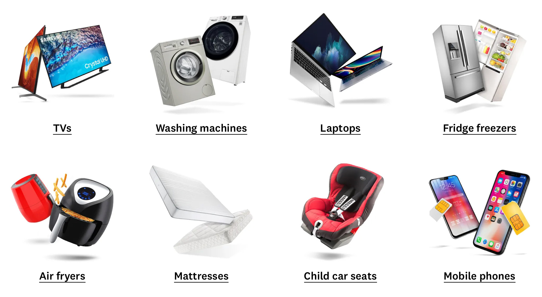
Many users only know us for our white good reviews. We call this the product eclipse – meaning this blocks them from seeing all the other useful consumer advice we offer. This perception has proven difficult to shift with certain cohorts.
Many users are in a perpetual on/off transactional relationship with us. This is where a user has a specific purchase decision to make, they join Which? to get the information they need to make that decision, then they leave. For many it will be hard to move them away from this, no matter how sticky we try to make our membership experience. We have to lean in to the fact that if they leave satisfied, they may come back again in the future when they have another product purchase need.
Outcomes
As a result of this ongoing work we have been able to increase our brand relevancy score by 4% points. We have increased our modernity perception with users by 5% points. Member satisfaction has also increased by 5% points to 92%.
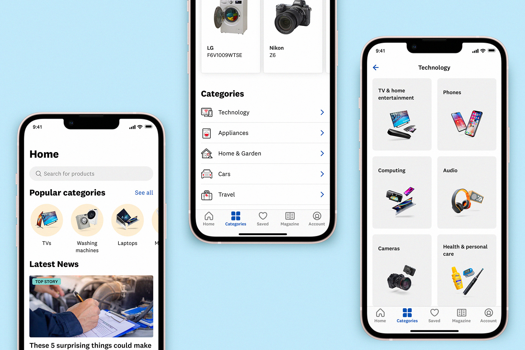
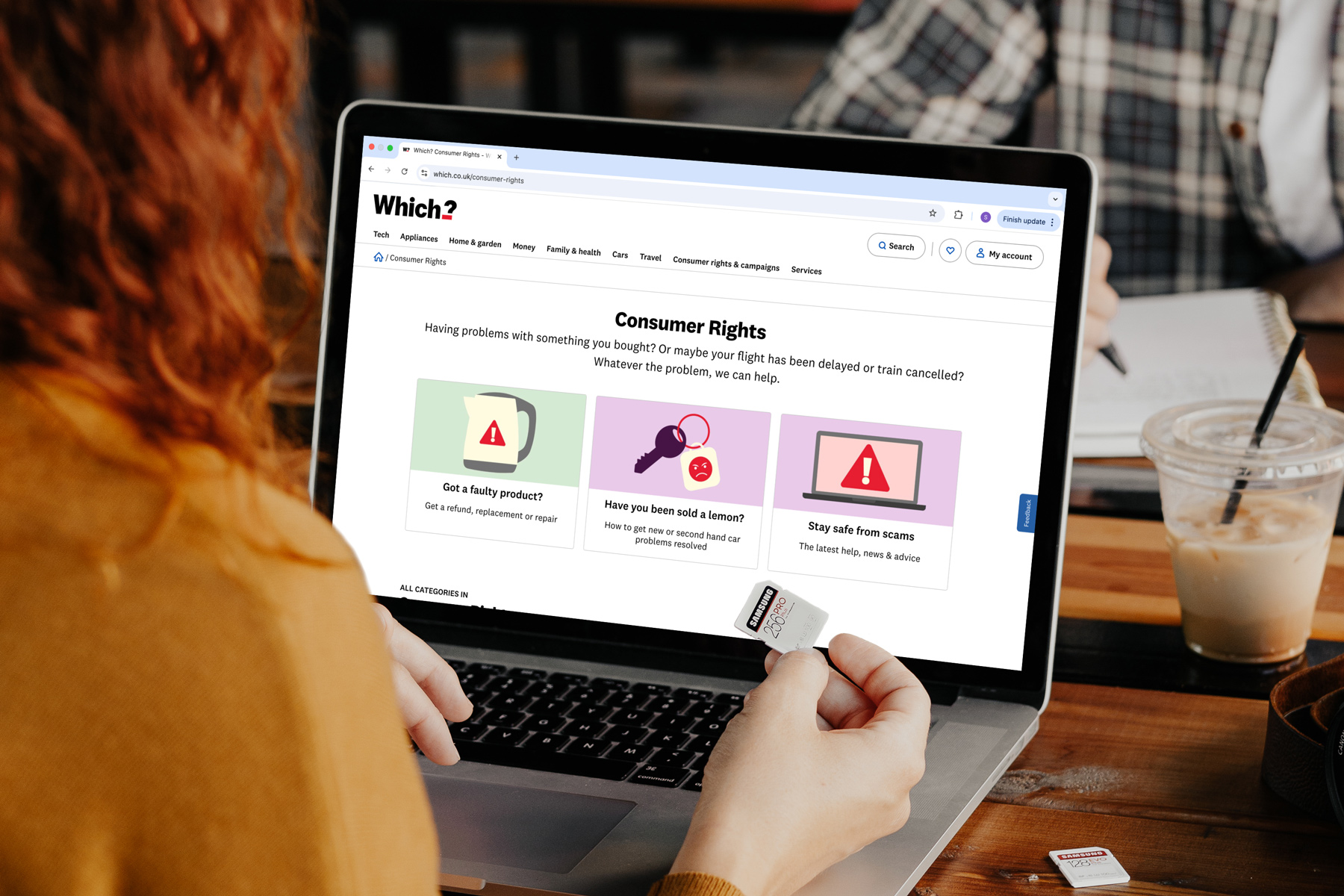
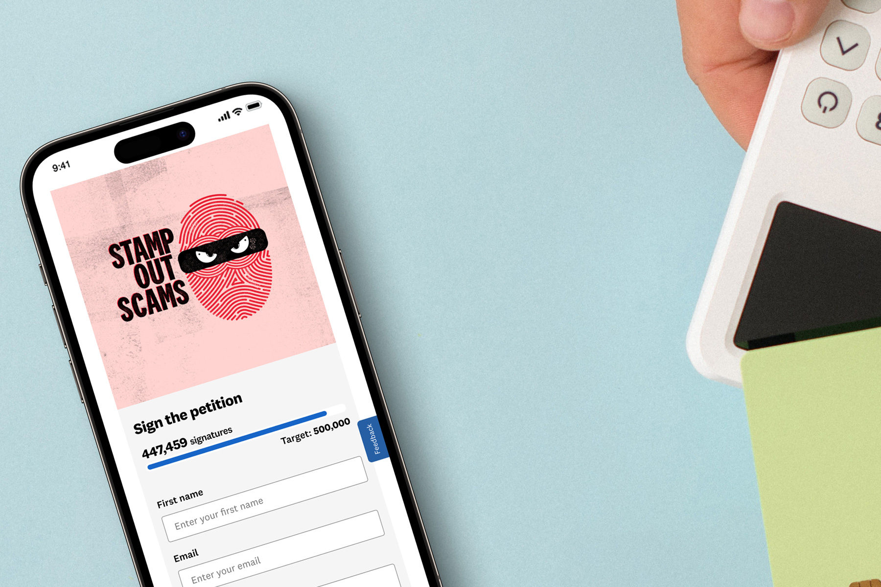
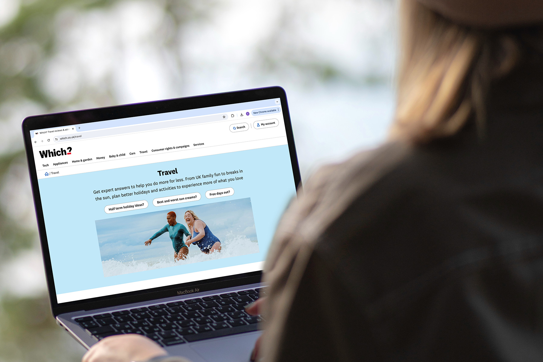
More images of the brand & product experience
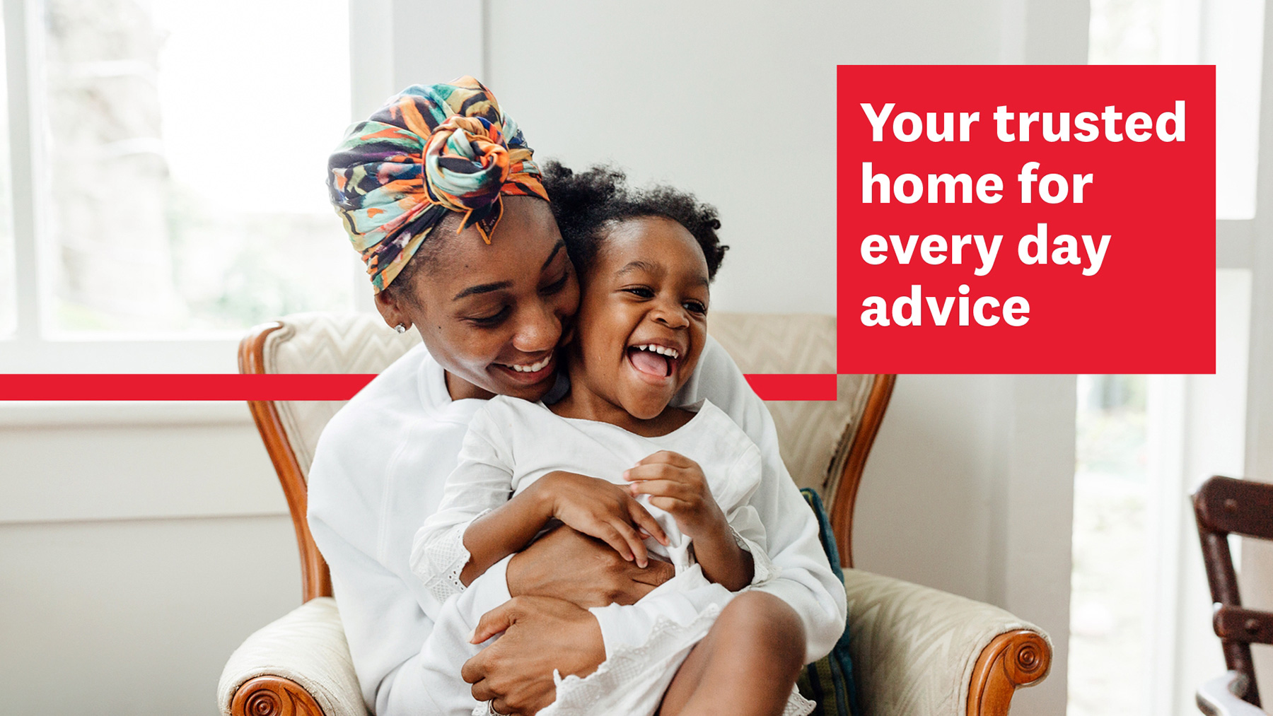
Below you can see how we are starting to roll out new brand imagery, icons and illustrations across the Which? website and app. You can also see how we are positioning the benefits of becoming a Which? member.
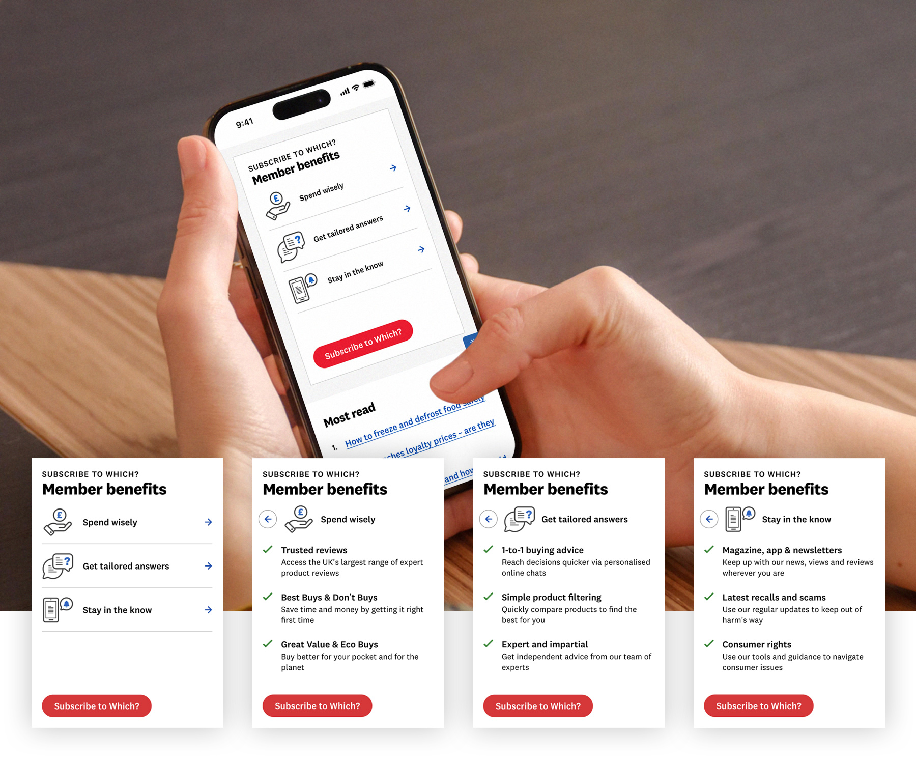
Moving away from describing features to actual member benefits enabled an increase in conversion rates
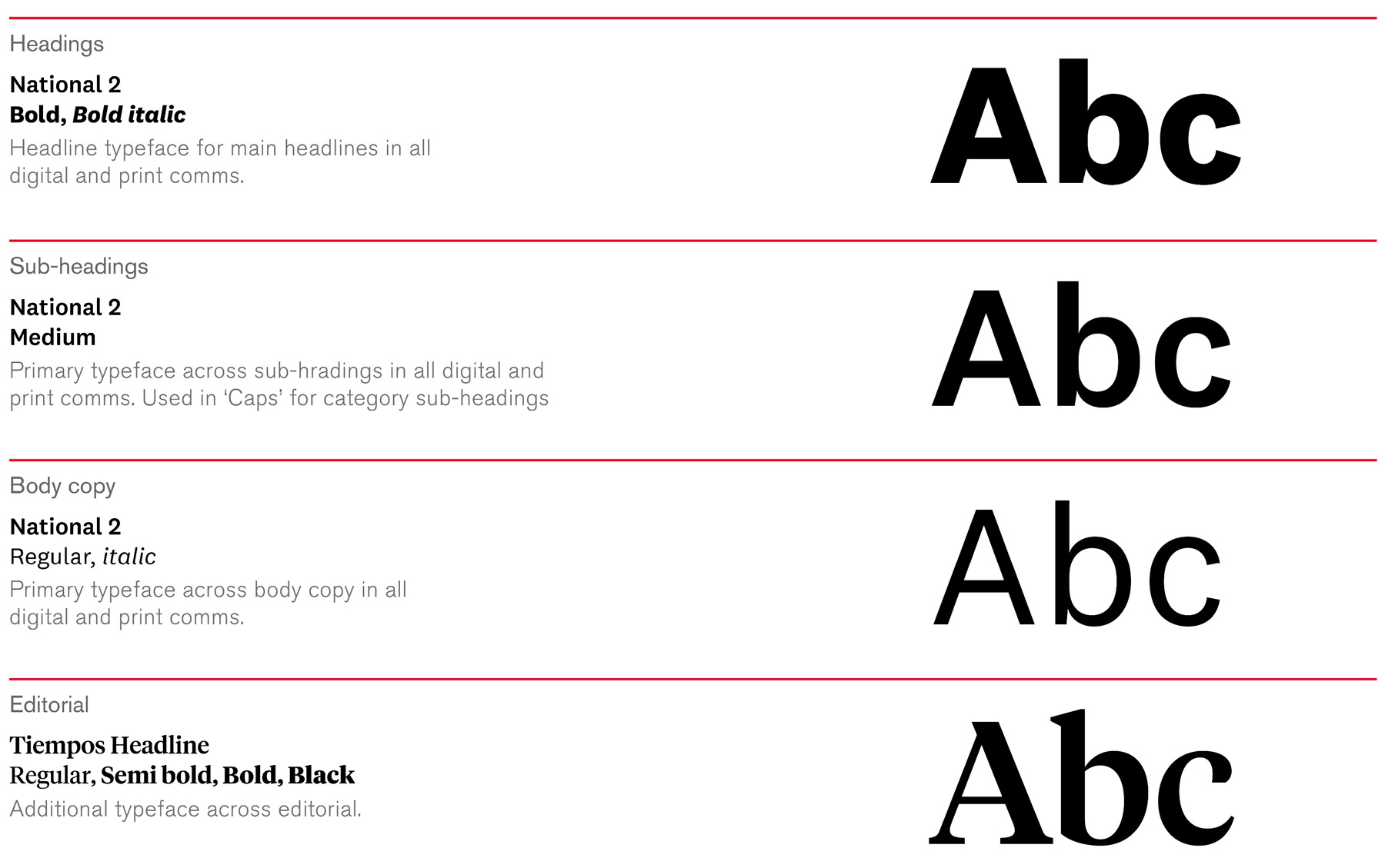
A little more detail into our type specifications.
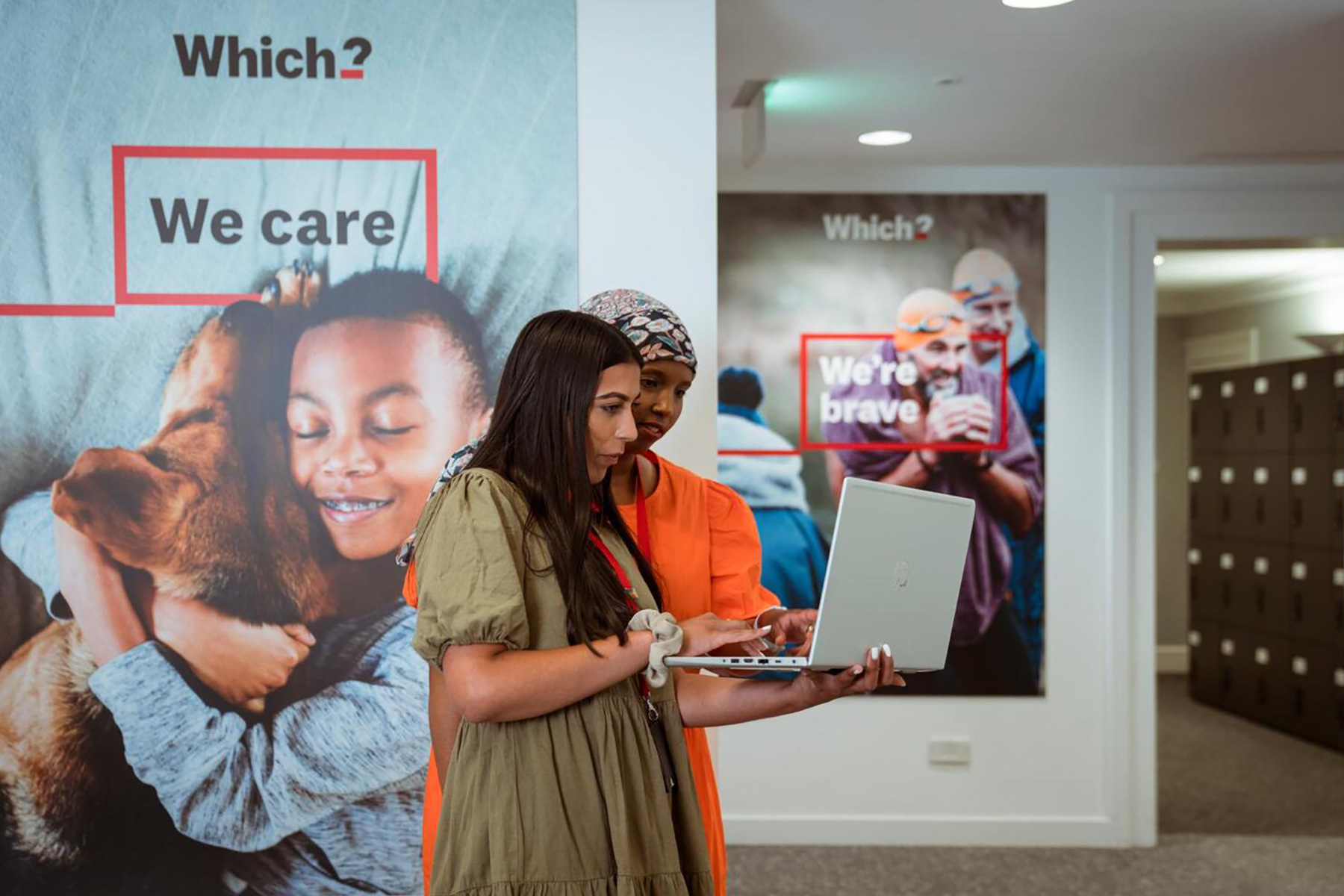
The brand manifesting itself in the Which? office
Contributing designers: ODA Branding, Damien Gallagher, Naomi Maister