Which?— VISIT WHICH?
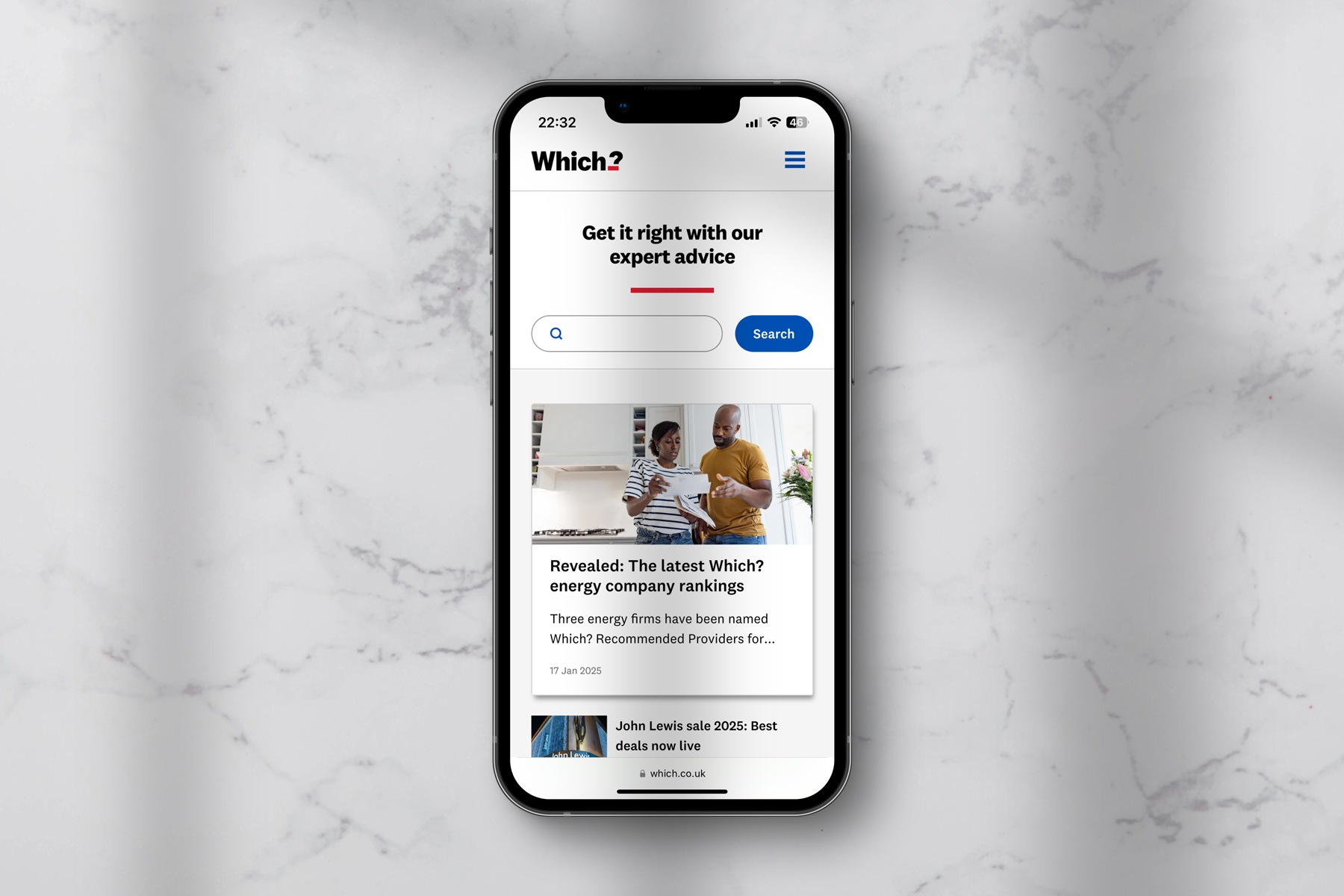
Mobile web view of the mobile homepage showing the proposition, 'Get it right with our expert advice'
Helping people make the right choices
Iterations we’ve made to our website IA, navigation, homepage and topic verticals have brought successful outcomes. We’ve seen significant increases in engagement with the global navigation and exit rates have dropped dramatically due to clearer onward journeys. This was a primary area of focus as we endeavour to make users more aware of the range of ways we can help them.
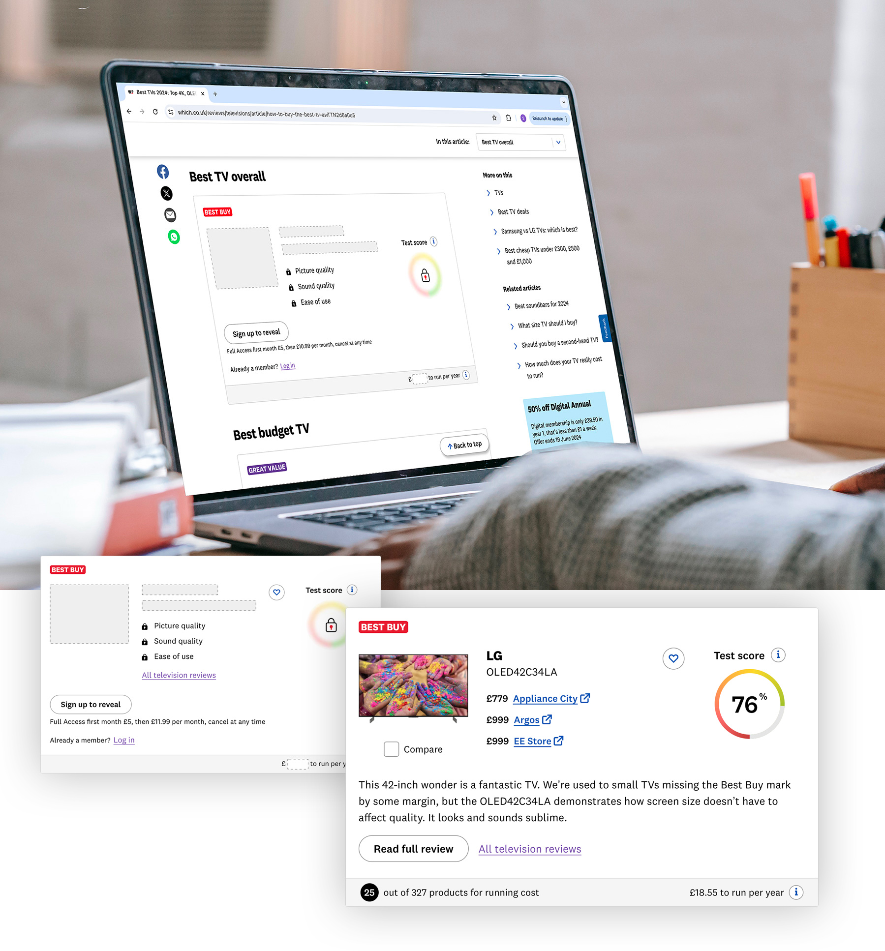
One of the successful improvements we made was surfacing more free content to non-members earlier in their journey via a new product hub template. Previously these users were faced with walls of locked content early in their experience. By better surfacing more free content to these users related to the product they were researching, we were able to increase conversion by 200% across these key journeys. Exit rates also dropped significantly, enabling us to build a greater rapport with these users.

New navigation design and IA structure has enabled users to find what they need quickly and discover new content areas
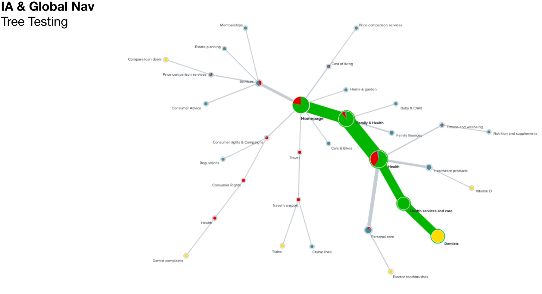
We robustly tree-tested various IA structures against common user journeys
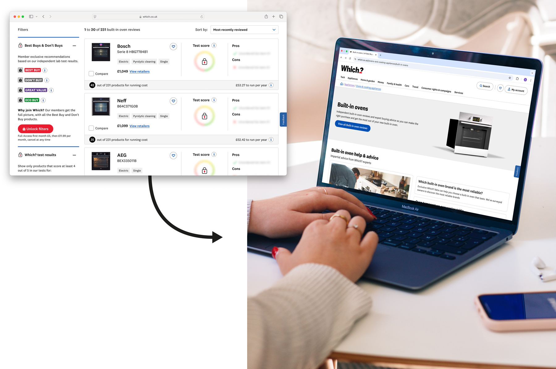
Left: An example of a logged-out product listing page that non-members would see when they selected a category in the global navigation. Right: the new product hub experience that gives greater affordance to free content – enabling us to meet key results regarding improved user engagement and conversion.
A best in class reviews experience
One of our major USPs at Which? are the trusted and independent reviews we create for thousands of products and services – from washing machines to broadband providers. We’re continuing to make sure we offer a best in class experience for our members in this space. In a world full of fake reviews and misinformation – it’s important people have a resource they can rely on for accurate information.
We know people rely on us for expert insights when they’re making important purchase decisions and we have a detailed understanding of their needs at every step.
We have done work to enable cross-platform save and compare journeys for our users that allows them to hone in on what matters to them. By improving these journey's and joining them up between the web and app experience, we've seen a big increase in user engagement and retention (+26%) by week 4 of membership. This is enabling us to draw direct lines between UX improvements and positive commercial outcomes.
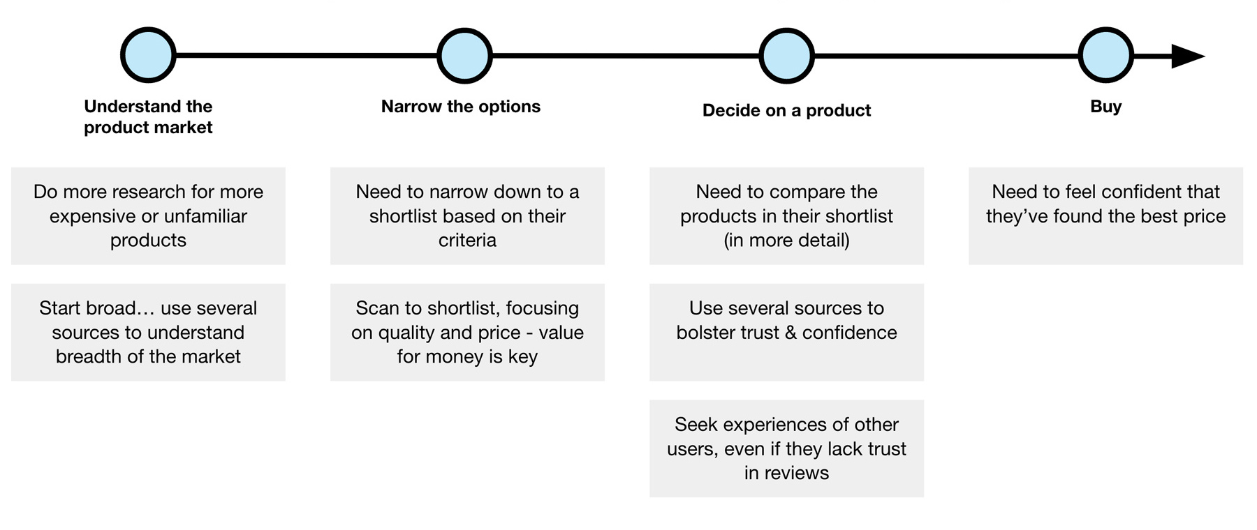
High level overview of user needs across the product research and buying journey
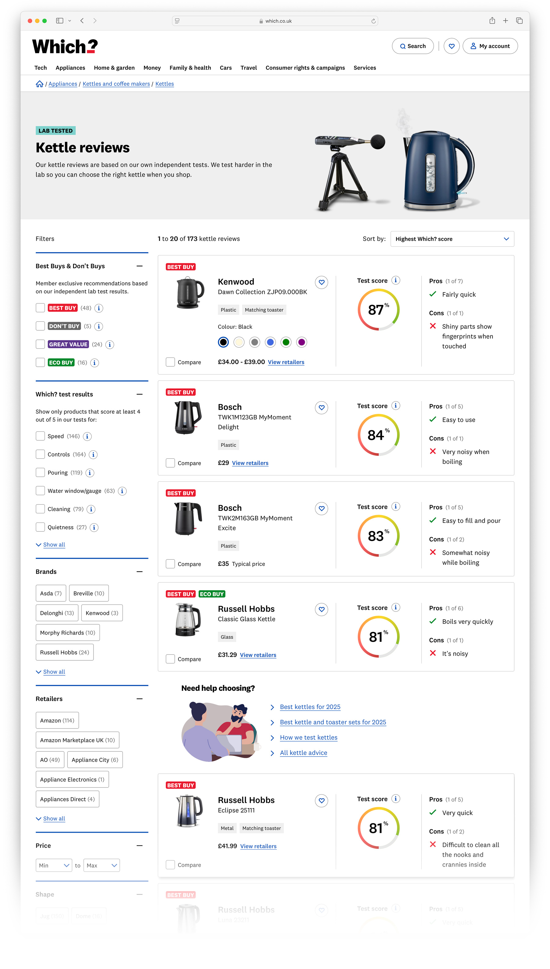
Kettle product listing page linking to our trusted and independent reviews – logged-in view
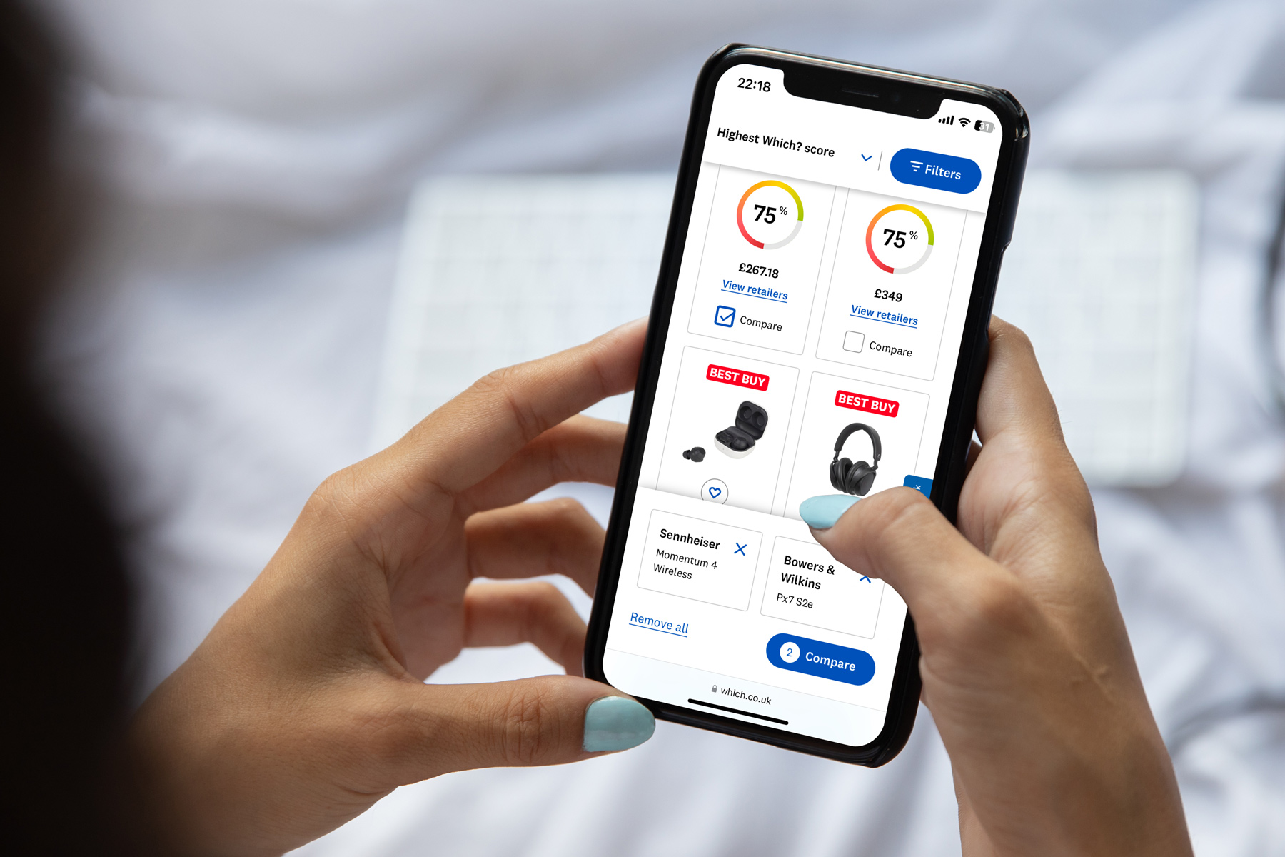
A user selecting headphones to compare
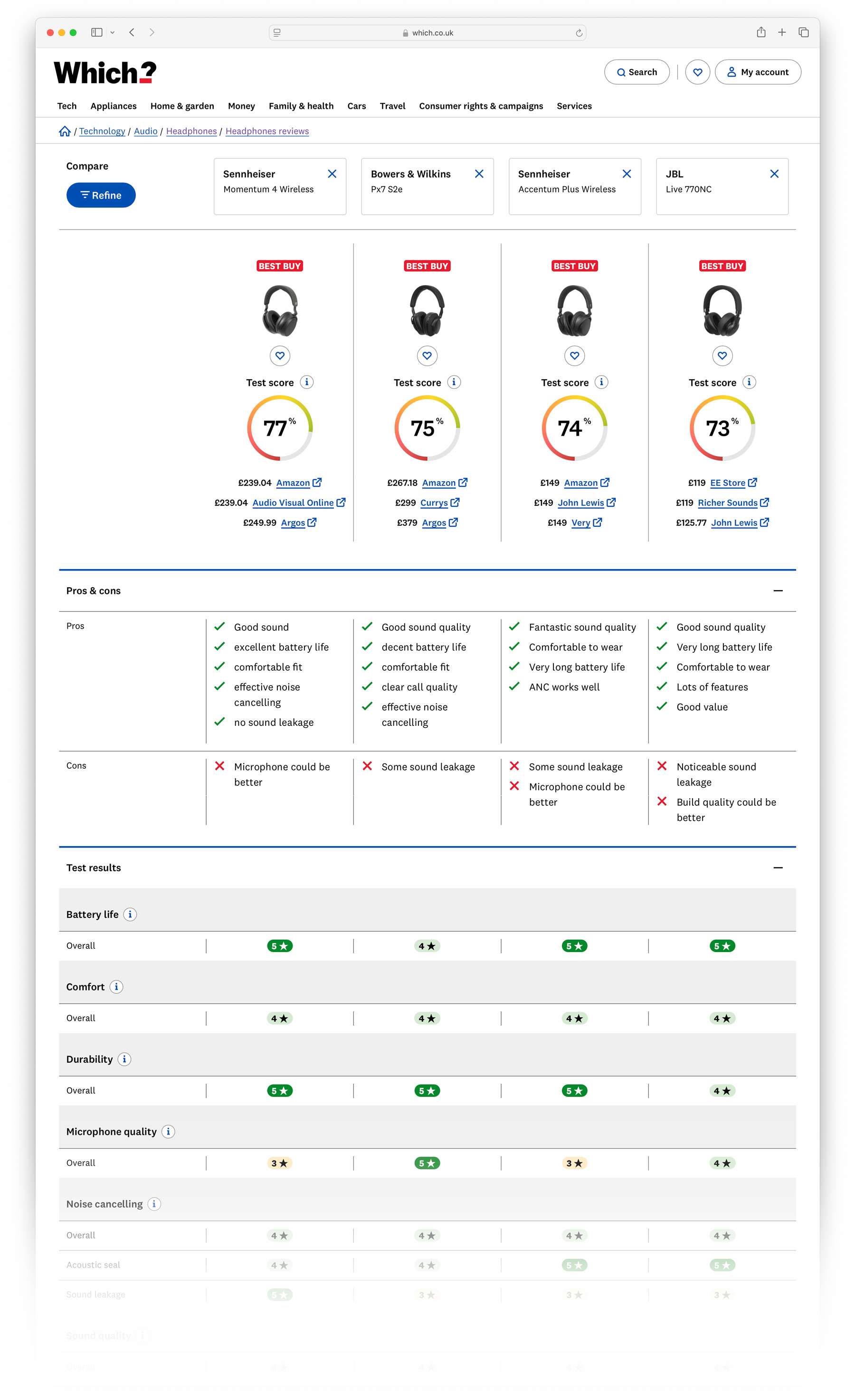
Example compare page with 4 headphones – enabling users to do thorough side by side research
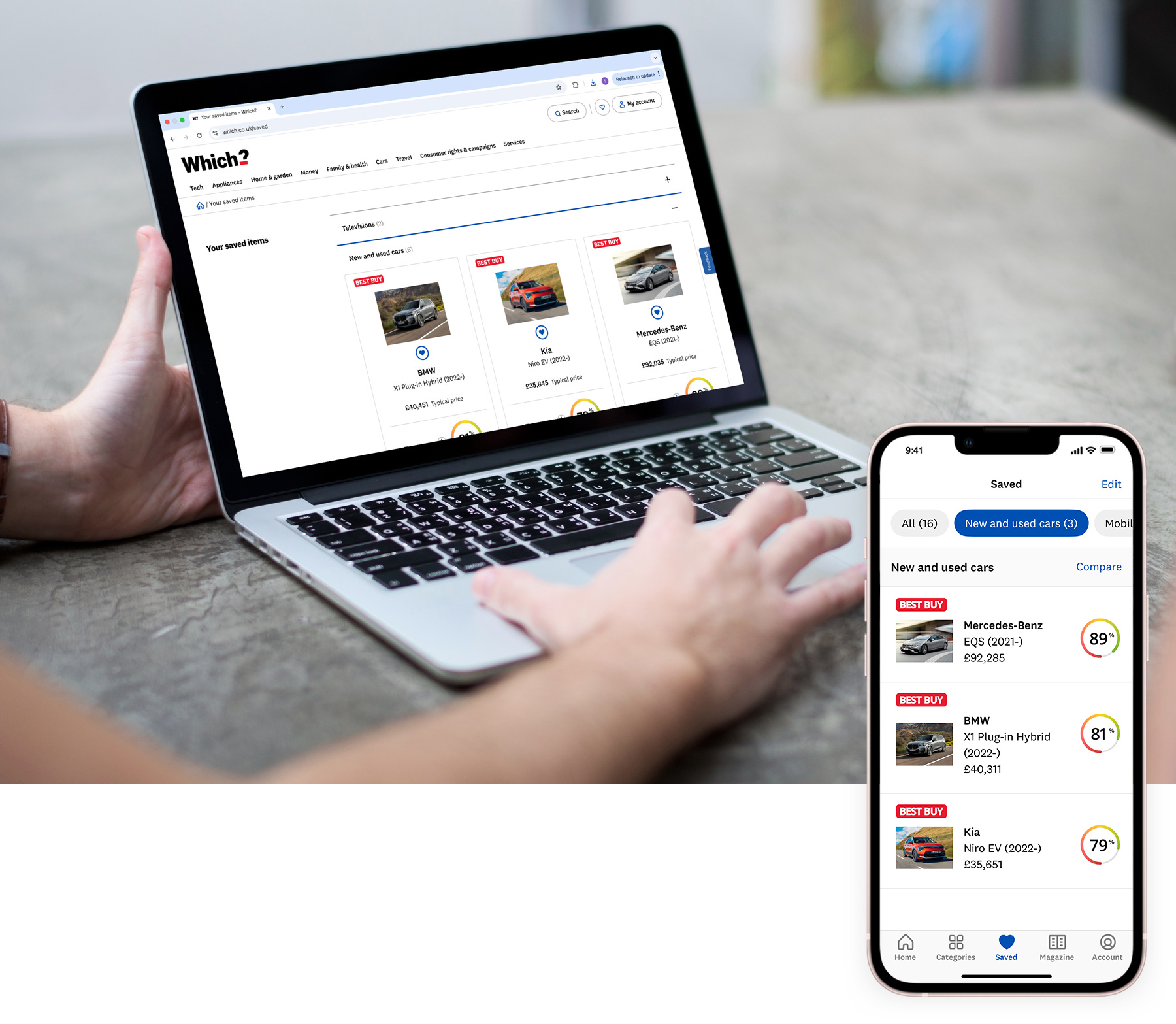
A user saving a range of different products – they're saved automatically across the web and app experience
Panel showing locked reviews content within an article with a contextual CTA to join Which?. Second image shows the content when a user is signed in.
Useful tools and advice to help you day to day
Another big area of focus has been helping people through the cost of living crisis. We’ve developed a range of content initiatives and tools to help people improve their financial situation.
We also have a range of tools to help people navigate tricky consumer situations, such as buying faulty goods or dealing with flight delays.

Desktop screenshot of a money topic sub-vertical that quickly brings users to high value content

Mobile web view of some of our helpful money tools and content
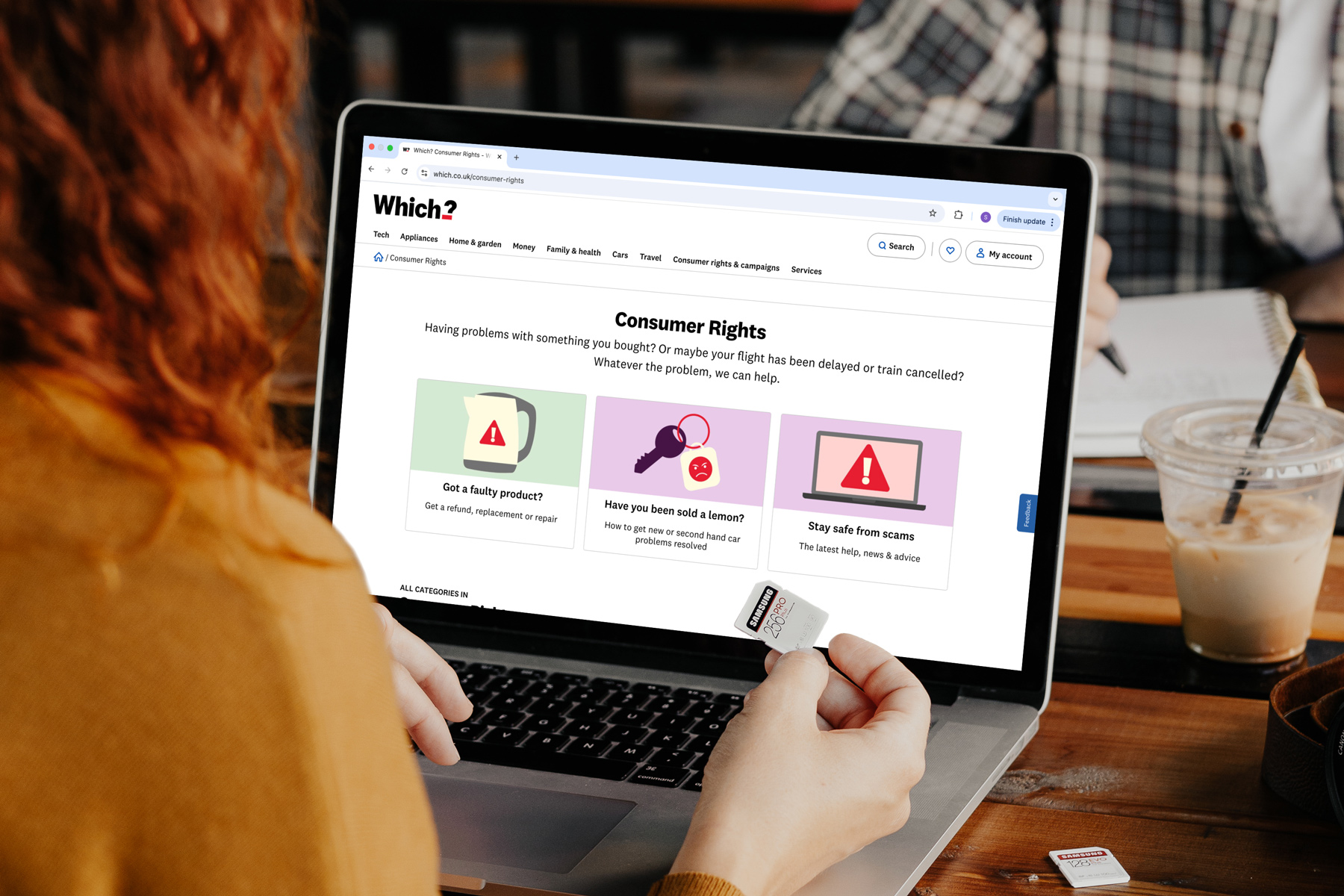
Routes into our consumer rights tools and information
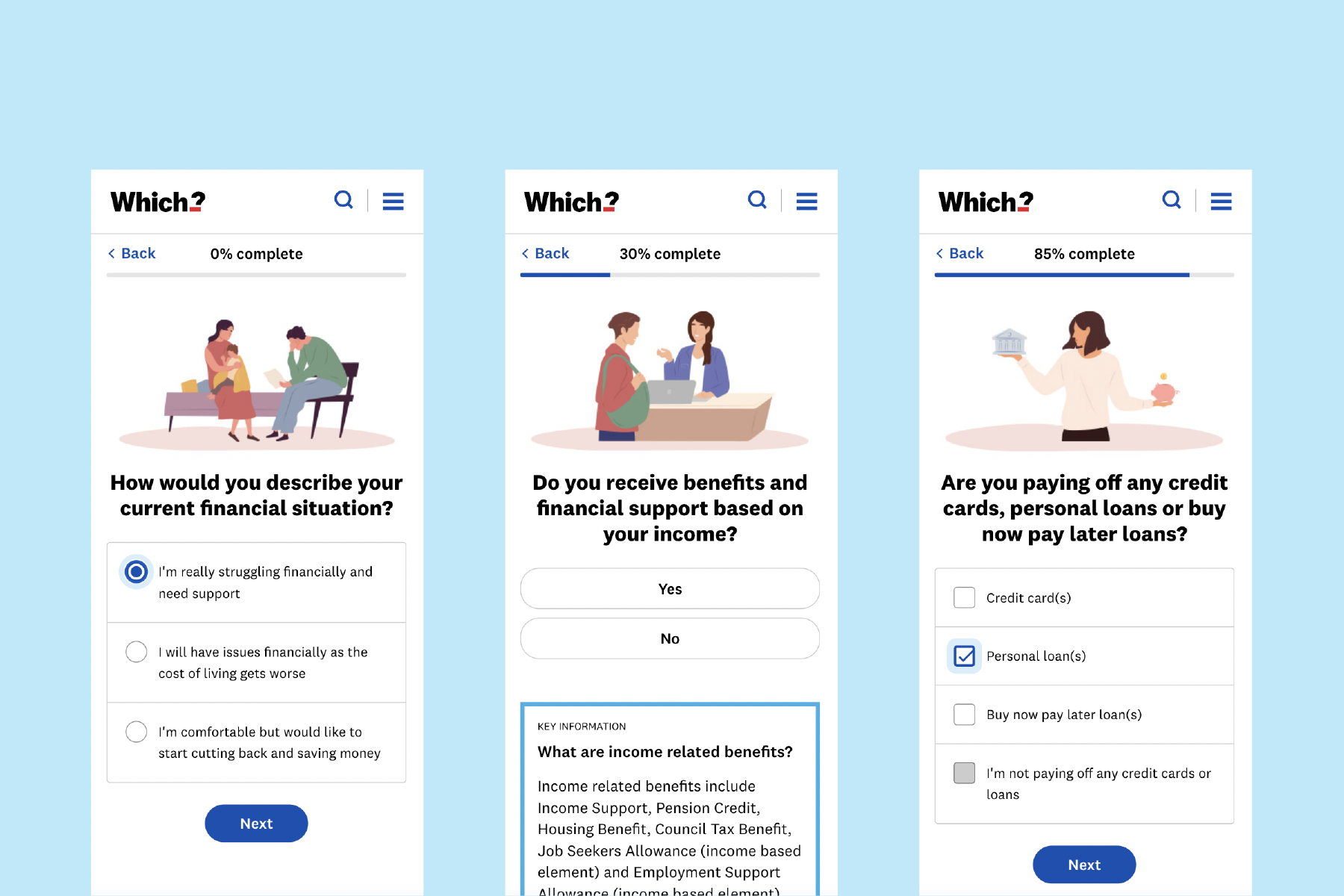
A tool to help people through the cost of living crisis
Contributing designers: Suzie Lowe, Murray Sylvester-Brown, Brian Bale